SCOPE
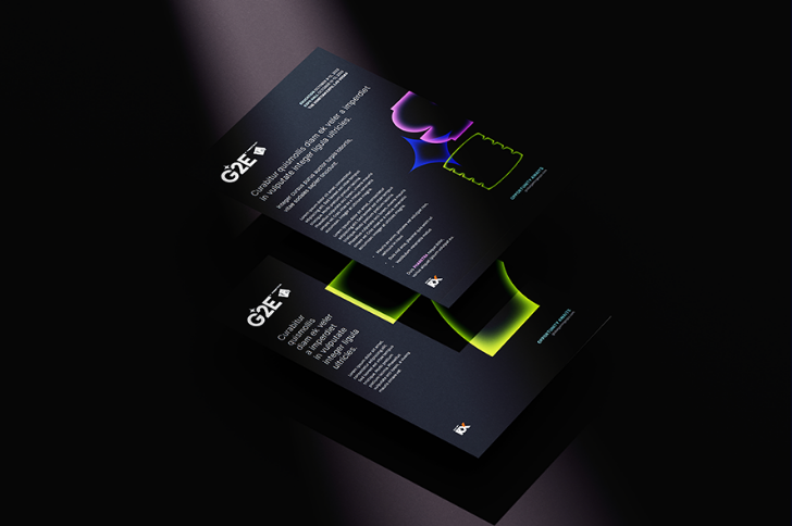
Logo
Identity
Brand Guidelines
BACKGROUND
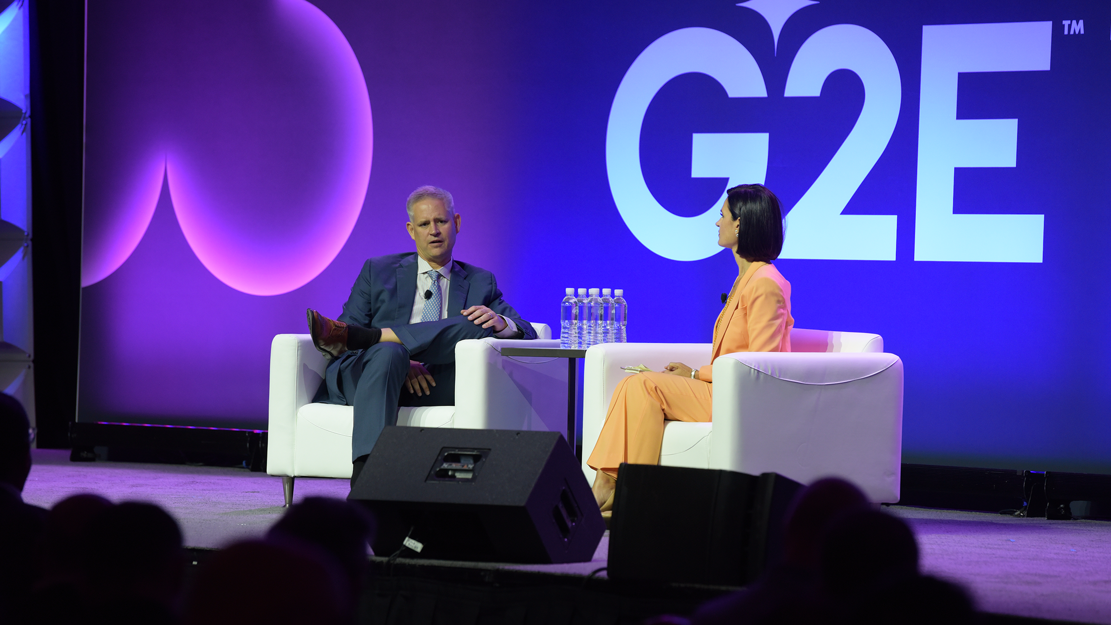
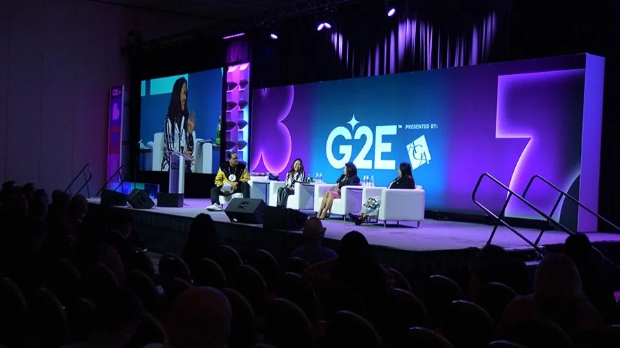
The Global Gaming Expo (G2E) is the premier trade event for the gaming industry held annually in Las Vegas. As the gaming industry grows, expanding into new markets and platforms, G2E needed their brand to capture the innovation and evolving landscape of the industry.
01 BRAND DEFINITION + DESIGN ELEMENTS
Informed by data and insights about the event’s audience and environment, I developed three distinct concepts, each inspired by different aspects of gaming. To explore their full visual potential, I curated detailed moodboards showcasing opportunities for logo styles, color palettes, typography, and motion.
02 LOGO
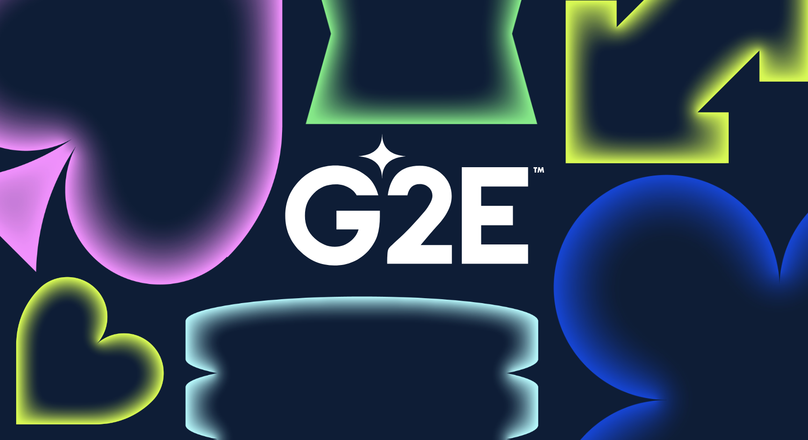
The G2E logo was designed with flexibility in mind, allowing space for the sponsor logo (AGA) to be added as needed. At its core is the evolved rhombus symbol, representing G2E as the North Star of the gaming industry while reflecting its diverse sectors.

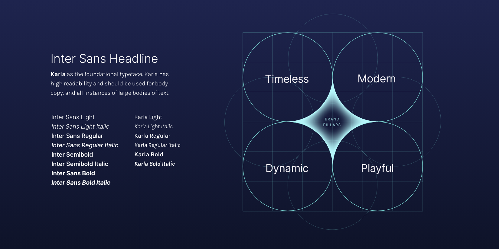
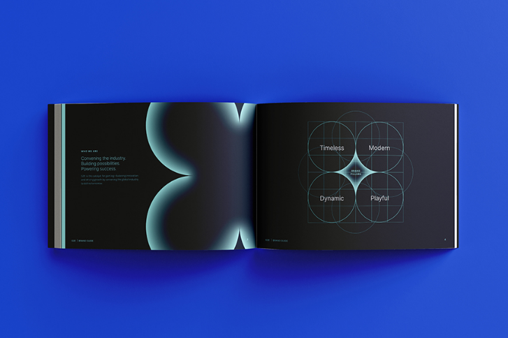
03 BRAND GUIDELINES
The brand guideline designs provided a comprehensive framework for maintaining a consistent and cohesive visual identity. They included careful usage and consideration of key brand elements such as iconography, text hierarchy, color, and more. These guidelines ensure clarity and alignment across all applications, reinforcing the brand’s distinct personality and visual impact.

a jackpot brand
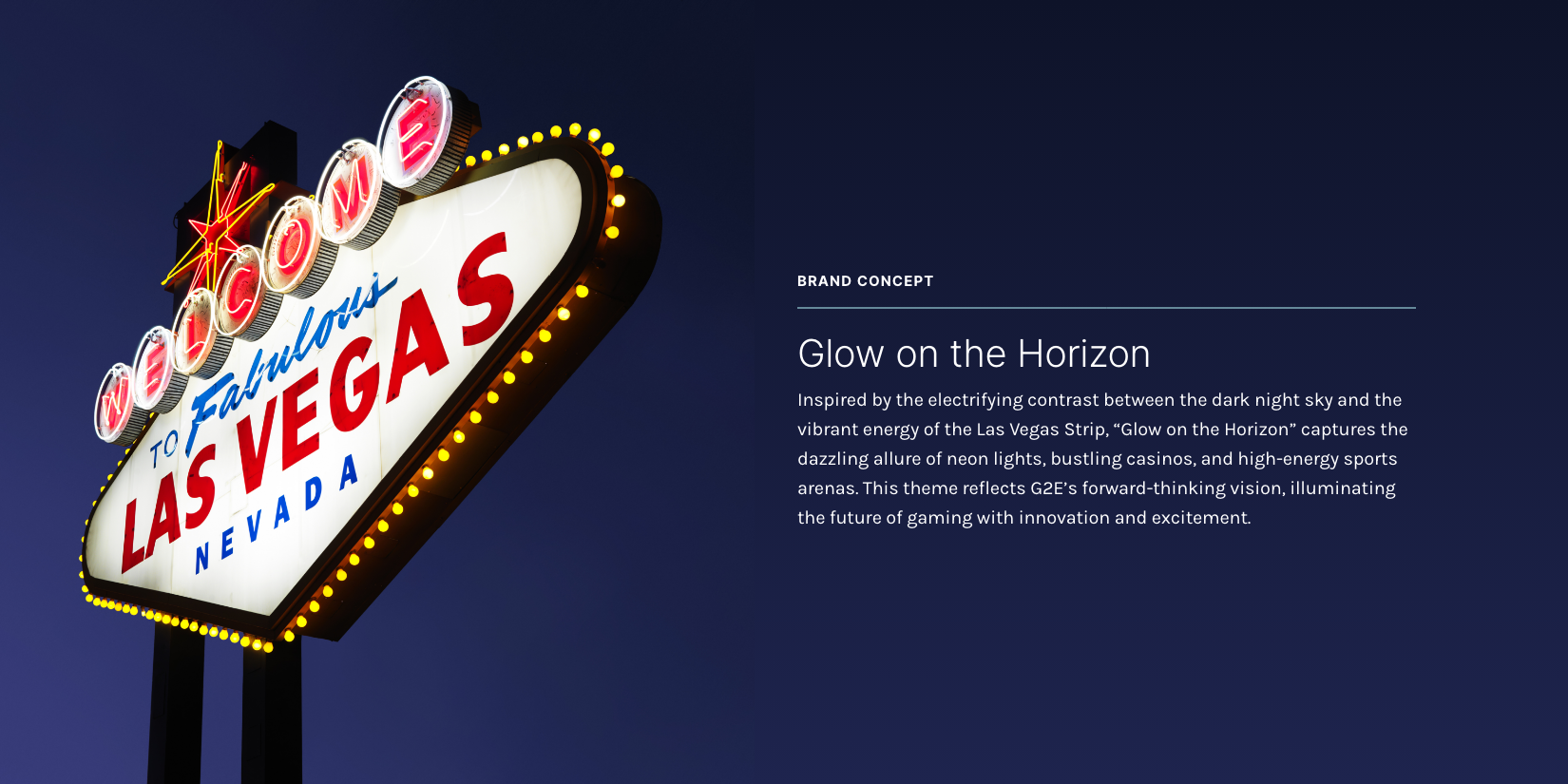
Anchored by a modern, sophisticated logo, powered by vibrant colors with high-impact treatments, and complemented by multipurpose typography and iconography, the new brand dazzles, rivaling even the brightest signs in Las Vegas.